Crib Skirt:

with this at the bottom:
Curtains:

with same bottom panel as skirt.
-OR-
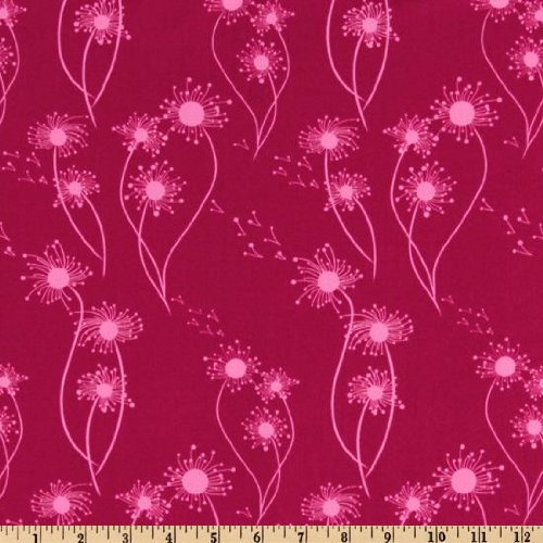
Crib Skirt:
plus
and curtains:
-OR- the one shown several posts below with the geometric print??
The wall color will remain some type of tan/sand/beige. My mom tends not to lean towards the cooler color palettes for paint, and since the room will be in her home it has to work. That said, I think a neutral wall color can be the basis for any color scheme, and any of these would look nice against a pale sand.

I LOVE the first option! I'm also partial to a neutral wall and lush, fun prints spicing it up! It makes a room much more versatile and sophisticated (even for a baby's room!).
ReplyDeleteI like both of these options better than the post below. I tend to lean more towards the first but I can see how the second would also look very chic against a tan wall with pops of raspberry in other parts of the room ( pillows or lamp etc). Just let us know what you decide!! :)
ReplyDeleteThe first option is adorable, especially the curtain pattern. It reminds me of a pillow case my mom had when I was little that I always loved. Very cute choices! You are looking awesome, by the way, with your cute bump :o)
ReplyDeleteI also like the first option the best!
ReplyDeleteI knew I could count on you guys! I'm excited :) I'm planning to go with the first option - turquoise and raspberry. I want pops of other color throughout the room, too (it's really a tiny room, so there won't need to be much) but I don't want the whole thing to end up too matchy-matchy and have TURQUOISE AND RASPBERRY assault your eyes when you walk in :)
ReplyDeleteI like both of them, but the second option with the yellow palette is adorable. That being said, I think the second option gives you more decorating options thanks to the blues and greens. Have you checked out Young House Love? They did their nursery with similar colors (minus pinks) in case that helps for inspiration ~ http://www.younghouselove.com/2010/04/the-big-nursery-reveal/.
ReplyDelete